
Core 1
Cloud Software Subscriptions
AnB Label Studio สำหรับออกแบบฉลากและบาร์โค้ด และ Receipt Statement Matching Engine สำหรับกระทบยอดอัตโนมัติ — ให้บริการแบบสมัครสมาชิกบนคลาวด์
แนะนำ Parallel Desktop Parallel Desktop เป็นเครื่องมือที่ช่วยให้คุณสามารถใช้งานระบบปฏิบัติการอื่นบนเครื่อง Mac ได้อย่างสะดวกสบาย โดยไม่ต้องอัปเกรดหรือเปลี่ยนแปลงระบบหลักของคุณ ซึ่งเหมาะสำหรับผู้พัฒนาที่ต้องการทดลองใช้ macOS public beta หรือ developer beta โดยเฉพาะอย่างยิ่งในช่วงที่ระบบยังอยู่ในระหว่างการพัฒนา ลดความเสี่ยงในการพัฒนาซอฟต์แวร์ การทดสอบ macOS beta บน Parallel Desktop ช่วยให้คุณสามารถตรวจสอบฟีเจอร์ใหม่ๆ และความเข้ากันได้ของโปรแกรมโดยไม่ต้องเสี่ยงต่อการทำให้เครื่องหลักของคุณมีปัญหาหรือไม่เสถียร เชื่อว่าจะเป็นประโยชน์อย่างยิ่งสำหรับนักพัฒนาที่ต้องการทดสอบการทำงานของแอปพลิเคชันของตนเมื่อใช้ระบบใหม่ ความปลอดภัยและความสะดวกสบาย…

AnB Label Studio สำหรับออกแบบฉลากและบาร์โค้ด และ Receipt Statement Matching Engine สำหรับกระทบยอดอัตโนมัติ — ให้บริการแบบสมัครสมาชิกบนคลาวด์

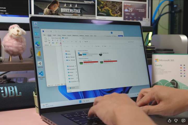
วิดีโออบรมทีละขั้นตอนสำหรับการรัน Windows 11 บน Mac ที่ใช้ Apple Silicon เพื่อให้ทีมใช้ MacBook ได้เต็มประสิทธิภาพ

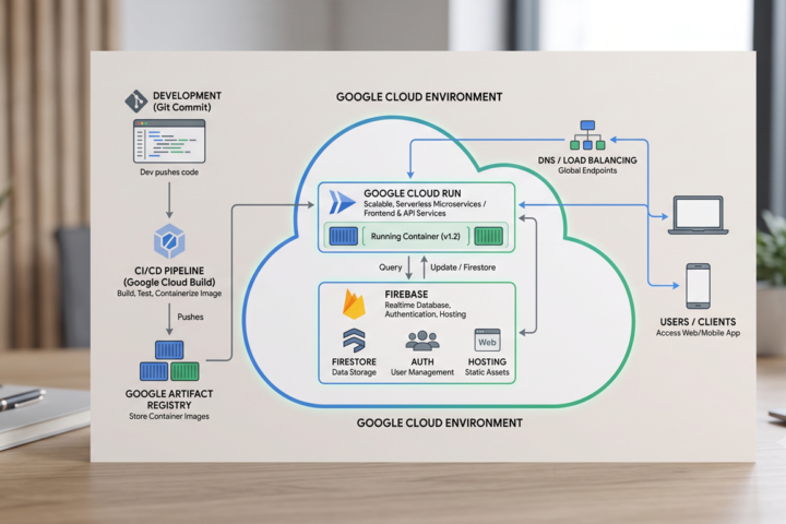
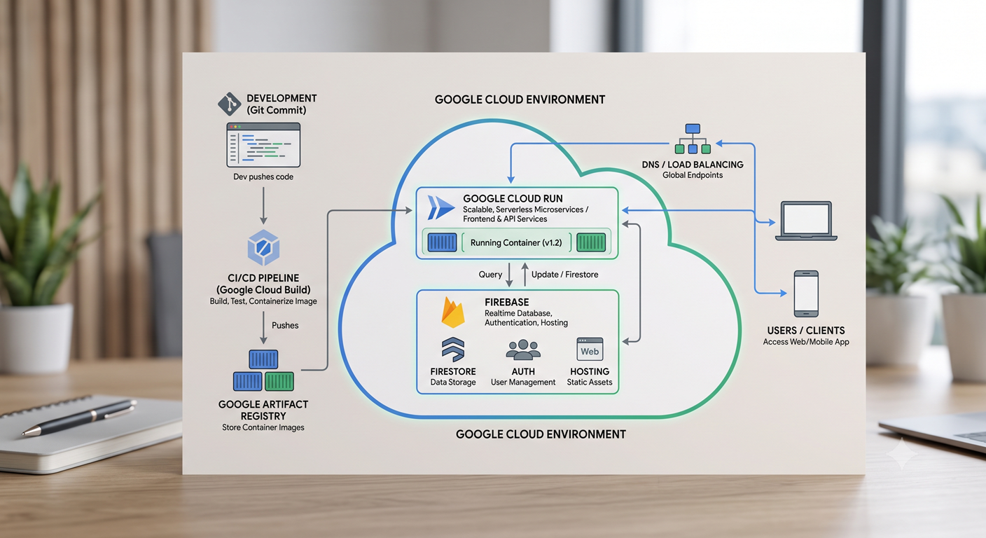
ออกแบบและพัฒนาซอฟต์แวร์ภายในองค์กรบน Google Cloud Platform เพื่อให้กระบวนการทำงานเฉพาะของคุณลื่นไหลขึ้น

สร้างเทมเพลตฉลากครั้งเดียว แล้วพิมพ์ได้ถูกต้องทั้ง Zebra, Honeywell และ TSC ด้วยโปรไฟล์เครื่องพิมพ์ที่ตั้งค่ามาให้แล้ว

กระทบยอดใบเสร็จกับสเตทเมนต์ธนาคารและ ERP โดยอัตโนมัติ แจ้งเฉพาะรายการที่ต้องให้คนตรวจสอบ
แนะนำ Parallel Desktop Parallel Desktop เป็นเครื่องมือที่ช่วยให้คุณสามารถใช้งานระบบปฏิบัติการอื่นบนเครื่อง Mac ได้อย่างสะดวกสบาย โดยไม่ต้องอัปเกรดหรือเปลี่ยนแปลงระบบหลักของคุณ ซึ่งเหมาะสำหรับผู้พัฒนาที่ต้องการทดลองใช้ macOS public beta หรือ developer beta โดยเฉพาะอย่างยิ่งในช่วงที่ระบบยังอยู่ในระหว่างการพัฒนา ลดความเสี่ยงในการพัฒนาซอฟต์แวร์ การทดสอบ macOS beta บน…
แนวทางการติดตั้ง Parallels Desktop บน Apple Silicon การติดตั้ง Parallels Desktop บน Mac ที่ใช้ชิป Apple Silicon M1 ถึง M5 เป็นกระบวนการที่ไม่ซับซ้อน และสามารถทำได้ตามขั้นตอนที่ชัดเจน โดยเริ่มต้นจากการดาวน์โหลดโปรแกรม Parallels Desktop…
Introduction to Cloud-Based Applications Cloud-based applications have revolutionized the way businesses operate in today’s digital world. These applications allow users to access…
Cloud-based software platform & solutions